
Solely Curated

Role: UI Designer
Information architecture, copywriting, prototyping, competitor analysis
Sept 2022 - Present
Overview
Solely Curated is a subscription based virtual styling and personal shopping service that allows people to shop by appointment without leaving their home - it is a start up in the testing and development stages.
Tools
Figma, Photoshop, Illustrator, Miro

Backstory
The business idea was researched and developed by an established team who have many years of experience in the field. In order to secure funding, the team required a prototype of the web app to accompany their pitch deck and get a better understanding of how the technology will compliment their service offering.
Currently, the service is being offered via email and zoom links, the purpose of the web app is to streamline the service and act as an introduction to the brand in order to scale the business.
After recommendation from a fellow UX designer & Entrepreneur, I was introduced to the CEO and onboarded as the sole designer on their team. In our initial meeting, we uncovered key information about the company, background research, service offering, target audience, user flow and brand aesthetics, then brainstormed ideas around each of the core features.
Role, Scope & Constraints
My task was to develop a high-fidelity working prototype for their web app which was “highly visual” and “similar in style to a dating app” with a focus on simplicity, clarity and ease of use.
As the brand aesthetics had already been established, I had to curate visual experience that accurately represented the brand, source/create icons & illustrations to communicate key concepts, create graphical elements to bring pops of colour to the page and craft text to create an appropriate tone.
As the project had yet to receive funding, it was necessary to come up with an interface that could be built with minimal resources so that the team could prepare to launch in Q2 2023. The design needed to be responsive as there would not be a separate app design, so my choices had to cater to both touch screen and mouse input.

Customer Profile
Female
Age range: 30-45
Working professional
Yearly salary 100k+
Looking for quality pieces
Shops contemporary and luxury
Time poor and values convenience
Lives in the affluent areas of London
Core Features

Sales Funnel

Consultation Sequence
Consultation Sequence
Consultation Sequence
Sales Funnel:
In developing the sales funnel, I drew upon my literary background and took inspiration from a classic narrative arc structure, keeping a steady pace and gradually revealing more about the Solely Curated story - all with a greater ratio of images to text:
-
Introduction: website lands on full screen logo like a "title" page, before a full screen image that represents the brand visually. The selling point is "experience" so I aimed showcase the curation of an experience from the start.
-
Exposition: set the scene with SC service offering. The team wanted a stronger focus on visual rather than text. Simple illustrations are an effective way to describe the brand offering at a glance, with minimal reading required. Subscription bar to continue the trend of simplicity - access to more details with a call to action button, whilst the key information is provided at a glance. Also an opportunity to introduce some of the colour accents.
-
Painting the picture: short clip or image to show how life feels with SC services, alongside first piece of text to communicate the value proposition. After providing a clear indication of what, it's a chance to give some insight into why SC might be the right choice and begin to build a sense of relatability.
-
Characters: looks styled by SC stylists with a short profile on each, attaching real identities to the brand. This continues to build on the relatability and demonstrate versatility as indicated in the brief as a selling point.
-
Close: marks the end of the introductory experience with an invitation to become part of the community.
Consultation Sequence
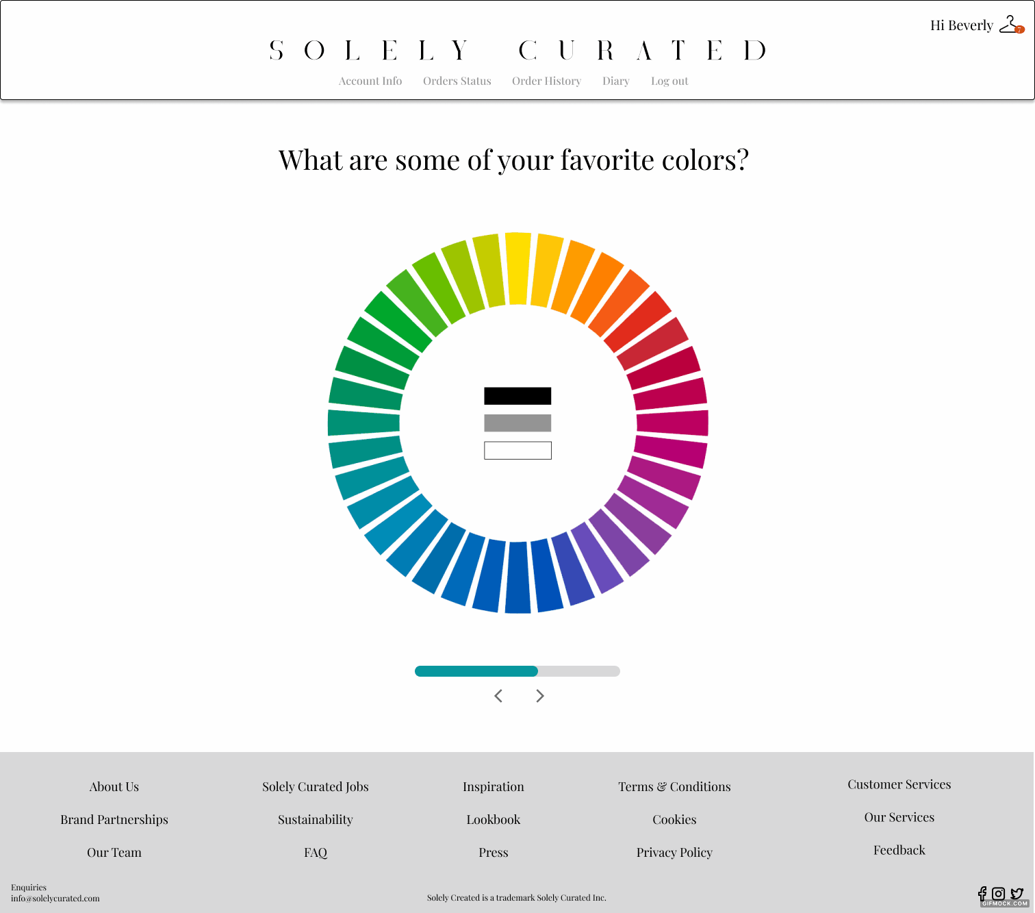
By using a conversational tone throughout the consultation sequence, I looked to give users a sense that they are and will be interacting with real people, catering specifically to their needs at all times. A series of "get to know you" questions in this swipe through, “dating app” style intends to create a sense of being "matched.”. This is how I interpreted the client’s reference to “dating apps”. I used as few words as possible and ensured the questions required very little effort, whilst remaining appealing to the eye - as a focus on ease of use.


User Dashboard


User Dashboard
The dashboard is stripped back and minimal, featuring a simple colour block design, calendar interface and upcoming schedule to help the user stay organised at a glance. Also includes access to order information, past and present. Despite all that goes on behind the scenes, the user should remain as hands off as possible and with easy access to anything they might need.

High Fidelity Design
Iteration 1 - presented to UX mentor and CEO.
Iteration 2 - sent out prototype to company advisors and stakeholders alongside feedback survey.
Iteration 3 (current, as displayed) - to be sent out to users who are testing the service.
Subscription Page

User Dashboard


"More information about the subscription packages" - CEO
"Put coloured background around home page icons for uniformity" - UX mentor
"Collect more customer data" - Advisors/stakeholders
-This or That (5 categories)
-Adding an upload a pic feature?"
"Highlight the VALUE of 99 per month, that customers also have access to work with a stylist on a 1-2-1 monthly basis if they don't want a consignment sent monthly." - Advisors/stakeholders
"Plug more keywords into text elements" - Advisors/stakeholders
Consultation Samples

Reflection

No matter the project, it is important to keep a key theme in mind. It was interesting to go through the design process of a product that has yet to launch as the data is based on a smaller subsection of users, as opposed to an established product which has feedback in abundance.
It has been a great experience to work directly with the CEO as I was given a lot of insight into the service as a whole as well as the progress of the project behind the scenes, which gave more meaning and context to the work. I was given a lot of freedom to try things out, discuss ideas and explain the reasoning behind my choices. Despite having a style guide and some reference material, there was a lot of room for experimentation and I got to add my personal touch - it felt like a truly collaborative experience.
Being my first project with a start up, it built up my confidence in presenting ideas and working reflexively as my understanding of the service and its target audience grew. I would’ve loved to be more involved with the initial research for the product to uncover my own insights and themes, but focussing almost entirely on design was a nice contrast to my prior project, which was entirely research.